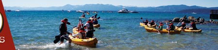
TAHOE WORLD PHOTO CONTEST The Lake Tahoe Concours d’' Elegance is North America’s premier wooden boat show and the Tahoe World is hosting a pho...
Midsummer Shakespeare After the curtain closes on this summer’s season of the Lake Tahoe Shakespeare Festival, the entertainment continues wi...
6 Great Camping Spots There are many public and private campgrounds around the Tahoe basin — here are six to explore ...
Spend your weekend in Desolation Emerald Bay to Lake Aloha features numerous alpine lakes for swimming, outstanding wildflowers and rugged mountain views ...
A round of golf on the cheap If throwing a frisbee around is one of your past times, or, if you enjoy walking around the outdoors or are looking for a new gam...
Food specials in the Tahoe-Truckee area
The Tahoe World compiled a list of specials around the area. This list continues to grow and we welcome more specials to add! Just e-mail
CHOW: El Rinconcito Mexicano Owner and Chef Roberto Gallardo opened El Rinconcito Mexicano because he wanted to bring home-made Mexican food to the people...
Register Now! Start your own blog, photo gallery,
and be part of the Tahoe community. Got a band? Post your MP3s,
and promote your gigs in our calendar.


 Lakeside in Tahoe City hosted Bassnectar last week for a sell out show ...
 As most of us free-spirited Tahoans know and are now and again reminded of, life...

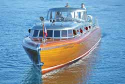 The Lake Tahoe Concours d’' Elegance is North America’s premier wooden boat show and the Tahoe World is hosting a pho...
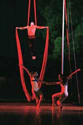 After the curtain closes on this summer’s season of the Lake Tahoe Shakespeare Festival, the entertainment continues wi...
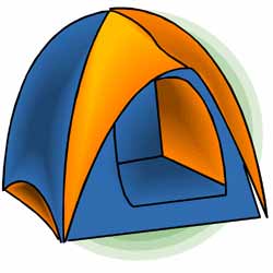 There are many public and private campgrounds around the Tahoe basin — here are six to explore ...
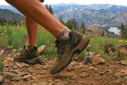 Emerald Bay to Lake Aloha features numerous alpine lakes for swimming, outstanding wildflowers and rugged mountain views ...
 If throwing a frisbee around is one of your past times, or, if you enjoy walking around the outdoors or are looking for a new gam...
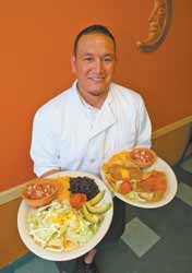 Owner and Chef Roberto Gallardo opened El Rinconcito Mexicano because he wanted to bring home-made Mexican food to the people...
 Although Four Peaks is not open this summer, diners hoping to get a taste of Chef Davis’ cooking will be able to enjoy a series...


